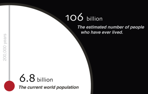
Despite the numbers of the dead being admittedly “highly speculative” in this visualization of the world’s population of the dead, I’m always a sucker for infographics. Click the image excerpt below to see the whole thing, or check out the blog post about it from the creator, Jonathan Gosier at Appfrica.
Categories
